Recent accessibility improvements for the Shostack + Associates website
Accessibility is an ongoing process. Learn about some recent updates to the Shostack + Associates website that increase accessibility and usability.
Every user deserves an equal online experience. That's why I'm proud to announce continued steps forward in my commitment to web accessibility. Over the past few months, small but powerful changes that direclty align to the World Wide Web Consortium (W3C) Web Content Accessibility Guidelines 2.1 have been implemented across the Shostack + Associates website. These changes bring a significant improvement to readability and usability across the website as we help make the web as a whole more user-friendly for all. So, what's different?
Visual updates
Text links and their hover state
Originally using a lighter version of our brand colors, these links are now using darker colors that still align with the Shostack brand. With this, I can be confident there is ample contrast between the text links and the white background on which they sit.
Pagination at the bottom of the blog
These links for page numbers in the blog feed were previously using white text on green to highlight the current page. That combination does not have enough contrast, so I've swapped the green for a darker background color, making the current page number much easier to read. I also upgraded the arrows from the basic `>` and `<` symbols to proper SVG arrows - this removes any confusion that may be caused by a screen reader calling out "greater than" while still maintaining ease of color adjustments via CSS.


Improved, and more, pill shapes
As part of the Shostack brand, there is a familiar pill shape that appears throughout the site. Previously, this was primarily used for button-like links with a green background. There was not enough contrast on those, so they have been upgraded to the brand orange (screenshots below). Additionally, the date of a blog post in the sidebar feed was lacking contrast (light grey on white). Now, these are white text inside a pill shape using the primary brand color.


Technical updates
Upgraded breadcrumbs list
The breadcrumbs component at the top of pages serves to show users where they are in the website, but also provides search engines with valuable information about the content structure in the form of schema data. Previously defined as basic text using span elements, these are now move clearly defined using list elements, ensuring screen readers and search engines both understand and express the relative and logical structure of the content. Some slight tweaks for visual style were also included here.
Hierarchy and clarity on heading tags
In accordance with Success Criterion 1.3.1 and 2.4.6, I reviewed all instances of headings throughout the site and adjusted as needed to ensure clear hierarchy. Additionally, the headings in the siderbar were given a new look and an aria-label to ensure their purpose is properly conveyed for screen readers.
Redundant links
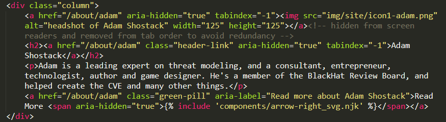
Users use websites differently, so in the original development of this website, the team agreed to incorporate navigation in multiple ways. To account for various instinctual methods, I built certain landing pages such that clicking a heading, an image, or a text link would take the user deeper into a certain area. However, having 3 links in a row that all go to the same place cluttered things up for screen readers and users that tab through the links with a keyboard.
To reduce confusion and redundancy while still maintaining the option for mouse users to interact as they may expect, linked elements such as headings and "Read more" buttons have been set to aria-hidden="true", removing them from the list of links a screen reader calls out. Adding tab-index="-1" also removed these items from the list of links that can be accessed via keyboard navigation, making it faster for users to Tab through a page.
Clarity for some links
Icons and other links with weak text (such as “Read more”) needed a little help as well, so these now include either an aria-label attribute or a screen reader only text element that is visually hidden. aria-label also replaces the title attribute on standard links, and is used, for example, to clarify when a PDF file will be opened in a new tab, another important piece of information for screen reader users.
Looking ahead
These changes ensure the content on the Shostack website is now more usable for people with visual, hearing, motor, and cognitive disabilities, whether temporary or permanent. But these changes also serve every visitor with clearer interaction, enhanced brand identity, and more meaningful navigation.
Website accessibility is an ongoing process, not a destination. I will continue to audit this website and strive to adhere to the accepted guidelines and standards for accessibility and usability. Should you experience difficulties while navigating or using the Shostack + Associates website, please reach out. I will do my best to assist you and resolve any issues.
About the author: Connie “Sunfire” Hill is a freelance web developer with experience in security, WordPress, and many things in between. They have been part of the Shostack + Associates team since 2021. They are open to website development and management opportunities, and can be reached on LinkedIn or Upwork.