Dashboards are Dumb
I see a lot of InfoSec metrics assembled into ‘management dashboards’. From a usability point of view, I think the visual metaphor of a dashboard is a dumb idea. It doesn’t fit the use cases and therefore doesn’t support effective user action based on the information.
Real dashboards
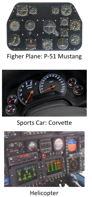
Dashboards are appealing because they are macho. The metaphor is derived from the instrument panels of airplanes and cars, and especially fighter planes and racecars. Managers like to think they are daring and brave fighter pilots and auto racers, so the dashboard as visual metaphor is superficially appealing.
To the right are three examples of instrument panels: a vintage fighter plane, a modern sports car, and a modern helicopter. The basic form is an array of individual meters, mostly analog meters on a continuous numeric scale. Some have thresholds or warning levels (e.g. ‘red line’ on the RPM gauge or the ‘over temp’ on the temperature gauge).
Below are two examples of security dashboards that make obvious the visual metaphor: 1) a compliance dashboard offered by ISACA and 2) Seculert’s executive dashboard. Of course, the ISACA dashboard is simplistic and stylized, but it does make the most obvious use of the visual metaphor. (I’m not talking about ‘dashboards’ that are merely assemblies of charts, graphs, and tables. They don’t really make use of the dashboard visual metaphor.)

ISACA compliance dashboard
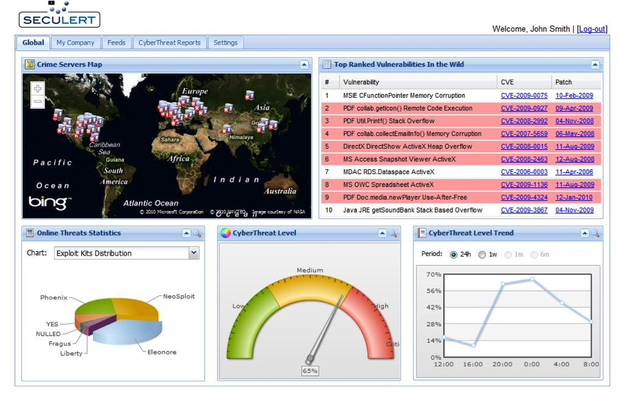
Securlert dashboard
Dashboards work when controllers match the meters
Going back to the original context of instrument panels for airplanes and automobiles, we can describe their use case in simple terms as a feedback loop:
- Look at the instruments
- Adjust the associated controllers (throttle, joystick, etc.)
- Repeat (1) to see the effect of (2), relative to goals or thresholds
The key to usability is the association between appropriate controllers and the individual meters. In a car, the controllers are the steering wheel, the gas pedal, the brake pedal, the ignition switch, and the gearshift, primarily. Generally, there are one or two controllers associated with each meter and the action of each controller is usually proportional to the metric that appears on the meter (e.g. Gas pedal and brake pedal control speed; gas pedal and gear shift control RPM, etc.). There are more controllers on a plane, but the same relationships hold between controllers and meters, at least for older planes.
Information security management is different
The dashboard metaphor doesn’t work for information security management because the ‘controllers’ – i.e. the actions and decisions of InfoSec management – are not in close correspondence to the output of the ‘meters’. At a CISO level and above, managers take action through budgets, spending priorities, architectures, staffing levels and resource allocation, performance evaluations, security policy management, security awareness programs, compliance audits, vendor relations and contracts, security development lifecycles and methods, incident response policies, and (hopefully) collaboration with business executives on information security implications of business decisions. In addition, there is a management function that is under-recognized in my opinion: InfoSec risk intelligence and organization learning/agility related to information security.
Even if your list of InfoSec management actions/decisions is different, I believe you’ll agree that almost none of these ‘controllers’ is in one-to-one or few-to-one correspondence with any of the ‘meters’ in the security dashboards. This means that there is no simple way to see the effect of adjusting any ‘controller’ by monitoring a ‘meter’, which translates to usability problems. Managers may still go through the motions of looking at dashboards, but their actual decisions will be guided by other information.
What visual metaphor would be better?
The right answer to this question might lead to a great business venture. I don’t have the answer, but I can offer some suggestions on fruitful directions.
There’s a lot of research that shows that people think about risk in terms of stories. Any visual metaphor that conveys a stylized story about risk and the ‘controllers’ associated with risk could be very useful. One approach is ‘rich pictures’ [link to http://www.jiscinfonet.ac.uk/InfoKits/process-review/rich-picture-example no longer works] associated with Soft Systems Methodology. Here’s another example. Of course, these rich pictures are static unless you watched them being created. A brilliant designer could probably turn them into dynamic animations, maybe using video game techniques.
Speaking of video games, there are many possible ways to adapt the way they visualize their virtual worlds, which often entail threats, risks, and uncertainties. One example is the campaign map from the Total War series for Windows PC, a personal favorite of mine. It is somewhat analogous to the rich picture example given above. One interesting feature of this map is the areas of ‘light’ vs. ‘dark’. The dark areas are where you, as a leader, have little or no intelligence. Only when you send a unit or agent into the dark regions do you find out what is really there. I really wish that security metric displays had a similar way of conveying uncertainty, ambiguity, and ignorance.
While not a solution in it self, another interesting visualization method for the social aspects of information security and risk is to use facial expressions to represent the risk perceptions or emotional disposition of various groups – users, adversaries, supply chain partners, regulators, etc. I experimented with this with good results in the 1980s when I built a prototype of Michael Porter’s competitive analysis method in Hypercard (!).
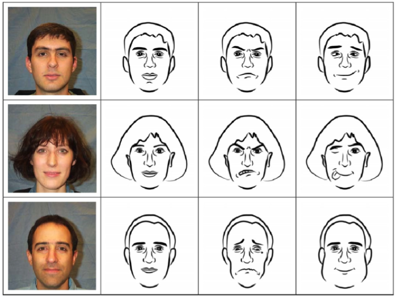
Automated facial expression animations could be useful to express risk perceptions by stakeholders
Summary
Dashboards work when the user has proportional controllers or switches that correspond to each of the ‘meters’ and the user can observe the effect of using those controllers and switches in real time by observing the ‘meters’.
Dashboards don’t work when there is a loose or ambiguous connection between the information conveyed in the ‘meters’ and the actions that users might take. Other visual metaphors should work better.
For more information on visual metaphors in design, check out these two seminal books: Donald Norman’s Design of Everyday Things and Edward Tufte’s The Visual Display of Quantitative Information.
Most “dashboards” are really Playskool Executive Activity Centers.
An enterprise-level dashboard is going to display time-series data since, for reasons that you noted, the trends cannot be observed directly and instead must be measured by proxies over time.
The ability to “drive” a security (or, really, any) organization given the extreme latency and indirect connection between decisions/actions versus feedback is the real Secret Sauce of successful (security) management.
For that matter, just knowing what should be on that dashboard (especially given the prevalence of corporate backseat driving) is an art form all its own.
@ Chandler: woot! Love the P.E.A.C. label. I couldn’t agree more.
Yes, I agree that InfoSec, at a management or executive level, is not something you “drive” like a car or airplane. That’s at the heart of my critique of the dashboard metaphor.
Your mention of “extreme latency” harkens back to my post: “Getting the time dimension right” ( http://newschoolsecurity.com/2010/05/getting-the-time-dimension-right/ ) Because of extreme latency and the need to make forward-looking decisions, I believe that models will be an essential element of information security / risk intelligence. There’s no other way to put all the data together in time. Likewise for indirect connections.
Thanks for your insights.
I just found a GREAT paper that provides the a very comprehensive analysis of risk visualization challenges and solutions.
http://www.knowledge-communication.org/pdf/envisioning-risk.pdf
I don’t say this often, but I’ll call this a “must-read” for anyone who is responsible for designing and implementing risk communications and risk dashboards.
Great debunking of the notion being pushed by some vendors – and unfortunately some infosec managers. You are exactly right and it is an issue I addressed in my book Information Security Management Metrics (Auerbach) in discussing useful metrics criteria. The notions of Actionable and Prescriptive. If you don’t know what to do with the information it’s pretty useless. I use aircraft metrics as example – there is generally a specific known response to each of the instruments information. Most in use even in the tech arena don’t meet these requirements – like NIST with percentage of servers patched, no. of virus’s detected, number of attacks thwarted, etc. Most are measures and not metrics having no reference point and certainly aren’t prescriptive.