The Visual Display of Quantitative Information
In Verizon’s post, “A Comparison of [Verizon’s] DBIR with UK breach report,” we see:
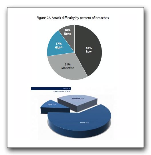
Quick: which is larger, the grey slice on top, or the grey slice on the bottom? And ought grey be used for “sophisticated” or “moderate”?
I’m confident that both organizations are focused on accurate reporting. I am optimistic that this small example in the utlity of pie charts will inform report writers. The report writers and their graphics departments, loving their customers, will move to bar charts to help them compare numbers between sources.
I’m confident that not using pie charts is a best practice.
Elsewhere: “The only time it makes sense to use a pie chart.”
And elsewhere: “The Visual Display of Quantitative Information, 2nd edition“
Sometimes, organizations are limited in palette by the color overlords in marketing. Not that I would know anything about it, I’m just kind of speculating here.
Thanks for this, Adam. You’re speaking for more than just yourself here (I was going to comment, but decided not to, for some reason).
And to Alex’s point, if marketing deliberately (or thru ignorance) frustrates the reasonable goals of other departments, they should be called on it.
Even if Marketing restricts colors, do they require pie charts?
hypothetically speaking? mayyyyybe.
one of the issues with a document with lots of data is creating variety in visualization. Having done a bit of this, it’s tough to give the reader 70 pages of bar charts.
I’m a big Stephen Few fan, fwiw.
If only there were a consistent standard for how people report these things? Or is that too distracting?
I know, I really owe you a real response on this. Soon, soon.
@Alex regardless, there’s no excuse for that terrible graphic with the pie chart segments wrapped in flags.
I’ll be the contrarian here and take the position that using pie charts is not always bad. Yes, I realize this goes against all the latest cool design stuff and Edward Tufte but that’s my story and I’m sticking to it.
It’s the abuse of pie charts that, IMO, makes them easy targets for poor visualization. If you have 3-4 datapoints, a pie can effectively convey what one is intending to present. Additionally, business people are used to seeing them and I’ve actually had people complain when I’ve tried my best NOT to use pie charts.
I see the “I’m against pie charts no matter what” stance in the same light I see Tufte’s “I’m against Powerpoint no matter what” stance. The chance of elimination is negligible. It’s more effective to improve the way people use Powerpoint than to rail against it and expect them to stop.