Visualization Friday – Improving a Bad Graphic
We can learn from bad examples and how they can be corrected. Case in point: the newly released SANS “Top Cyber Security Risks” report . Here’s the first graphic in the report:
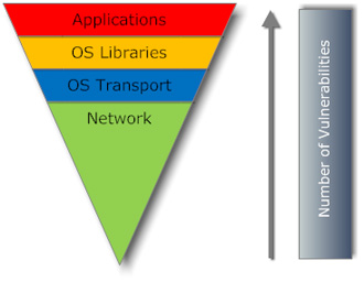
(I imagine that this graphic was created by a professional designer based on some simple sketch or even just notes from an expert. I assume that the designer picked all the colors and shapes. Pretty, isn’t it?)
But what does this upside-down pyramid mean, with the arrow by its side and a bar labeled “number of vulnerabilities”? My first several interpretations turned out to be mistaken. I thought the pyramid shape was significant, which it isn’t. There is no meaningful horizontal axis. I thought the colors might be significant (i.e. red = “most severe” and green=”least severe”) but that was mistaken. I thought the bar labeled “number of vulnerabilities” was some separate quantity being represented, which it isn’t. For a moment, I thought the arrow might signify some sort of migration or causation path. Wrong again. Finally, I thought the vertical size of each segment of the pyramid was significant, as if it was proportional to the number of vulnerabilities in that category. Muy wrong-o! The three top slices are all the same size, which suggests they are sized to allow the text to fit comfortably, not to represent any quantity.
I puzzled over this graphic for almost 15 minutes before I was confident I knew what it was trying to communicate.
I created this alternative graphic to communicate the same message more clearly:

This simple graphic expresses the essential message that “total vulnerabilities” is the sum of each of the components. That is the whole message – nothing more. Topologically, it’s basically a Venn diagram. Because the individual boxes are not quite touching, there is less chance for the reader to assume that the box size (or shape) matters in any quantitative sense. You aren’t visually adding them up in any direction, and therefore you don’t need any axis or axis label.
OK. This graphic isn’t as pretty as the one above, but at least it’s clean and the meaning is very apparent. There’s little room for misinterpretation.
The bigger question is why would this piece of information merit a graphic in the first place? Wouldn’t a sentence with a bulleted list work just as well? I think it would. Thus, this is another case of graphics overkill.
Moral of this story: don’t simply hand your graphics to a designer with the instructions to “make this pretty”. Yes, the resulting graphic may be pretty, but it may lose its essential meaning or it might just be more confusing than enlightening. Someone has to take responsibility for picking the right visualization metaphor and structures.
I first saw this and also figured there had to be something in that graphic, and even kinda thought you were being harsh!
But…uhh…all that graphic business just to say 1+1+1+1=4? You’re right, wtf?
Yes, at first I was thinking I was being too harsh, too. But then I saw this graphic duplicated on various blog and news sites. No one seemed to notice it’s lack of meaning.
It’s the first graphic in their report. It should probably convey the main message, or at least an important message.
Again, this is just a lesson for all of us and the process we use to create graphics.