Visualizing Risk
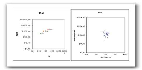
I really like this picture from Jack Jones, “Communicating about risk – part 2:” [link to http://riskmanagementinsight.com/riskanalysis/?p=354 no longer works]

Using frequency, we can account for events that occur many times within the defined timeframe as well as those that occur fewer than once in the timeframe (e.g., .01 times per year, or once in one hundred years). Of course, this raises the question of how we determine frequency, particularly for infrequent events. In the interest of keeping this post to a reasonable length, I’ll cover that another time (soon).
And I’m looking forward to how to Jack says we should determine those frequencies.
One suggestion for improvement: state the timeframe on the chart label: “Loss Event Frequency (per year).”
“One suggestion for improvement: state the timeframe on the chart label: “Loss Event Frequency (per year).”
Very good catch. I’m guessing that’s either an oversight or a limitation of excel and/or posting the image to the blog.
Yep. Oversight. Thanks for pointing it out!