Visualization Friday – Back From Hiatus
Hey all, sorry it’s been so long since I put up some eye candy. Today’s posts come from the usual sources (flowing data and other various information design blogs) but I also wanted to point you to a new source of cool: http://www.informationisbeautiful.net/
So without futher adieu, your Visualization Friday Posts (some pertinent to the display of information security metrics and knowledge, some just downright fun & cool).
INTERACTIVE DATA SCULPTURE

From :
Visual Gravity: The Physical Weight of Data
WORDS OF WISDOM FROM STEPHEN FEW
Ok, so not a visualization, but information expression architect (my made up title) Stephen Few shares some thoughts on visualization and real world examples of impact:
http://www.perceptualedge.com/blog/?p=601
Seriously, if you’re going to develop and present dashboards or powerpoints about security metrics to any audience but *especially* decision makers, I’d get into Stephen Few.
THE GREAT CITIZENRY FIREWALL
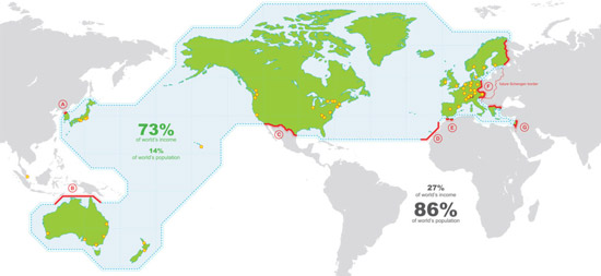
Did you know about the Schengen Wall? Here’s a great map-based visualization about it found off of http://www.informationisbeautiful.net/2009/walled-world/
JUST FOR FUN
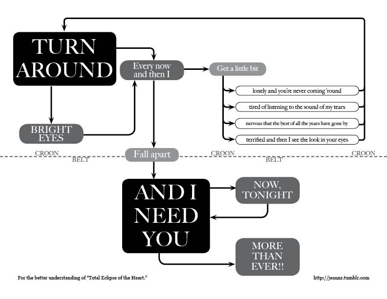
The Total Eclipse of the Heart Flowchart.


Cool stuff! Can I ask you to copy images to our server so that they don’t break when random servers around the net break?
Nice to see the Schengen Wall visualization, its Federated Identity IRL. The world is already federated, its just the security mechanisms that are lagging